Worldwide / 2013-2017
Interior
Retail Design Concept for Bang & Olufsen
Drawing on a legacy of innovative and foresighted design, the luxury audio and design brand Bang & Olufsen’s new store design concept was created with the intention of translating the brand’s innate ability to create unexpected and magical user experiences into the overall retail experience.
project overview
| Location | Worldwide |
| Rollout | The first store with the new retail concept opened in Copenhagen in April 2013 and the concept has since been rolled out across several other locations globally. |
| Area | From 50 m2 to 200 m2 and above |
| Creative Director | Johannes Torpe |
|
Senior Designer / Project Leader | Helle Maach |
| Senior Architect | Matthias Kisch |
| Design Team | Annika Göransson, Emil Thomsen Schmidt, Brian Ulbrichsen |
| Materials | Wood, brass, leather, textiles, stone, marble |
| Related Projects |
Nexus House of Sound and Vision, B&O PLAY Shop-in-Shop Concept |
| High res press downloads |
design concept
Elements of surprise and magic, a homely atmosphere and the idea of ‘sound as hero’ were fundamental principles in the development of the retail store concept. Interaction was also a key point and the shopper journey is hence intuitively designed from start to finish. The customer is able to interact with various elements within the store using their smart phone and can be the narrator of their own experience.
“We wanted to draw customers into the Bang & Olufsen universe and create an emotionally engaging experience that is just like the one you have when you interact with the products.”
design focus
Modularity
One of the key considerations in the design process was the design’s modularity and scalability, so as to allow for easier flexibility and international expansion. The design team thus created an extremely streamlined modular system that ensures a high level of familiarity, whether you enter a store in New York, London or Shanghai. To accomplish this, the team created three ‘zones’ within the store, which enable easy implementation in spaces of various sizes.
Feeling at home
Sound systems and televisions are products that have a natural place in most homes. The designers hence wanted to create a retail space that would make visitors feel welcome and relaxed; like visiting a friend with good taste. Custom furnishings, sound and images are united to form a coherent and cosy yet exclusive whole. To further enhance the experience, customers are met by the smell of fresh coffee and the traditional sales counter has been adapted into a ‘social’ piece of furniture where one can casually hang out on bar stools while discussing a purchase.
Sound as hero and a touch of 'magic'
As a brand that is renowned as being a pioneer in the audio industry, the store concept is suitably designed with impeccable acoustics in mind. Large acoustic wall panels mounted in fabric were created as modular elements that can be customised to all room sizes. An interactive speaker wall is designed to provide a simplified sound-testing experience. Speakers are hidden behind individual wall panels and revealed one set at a time, giving each model its own limelight and allowing the customer to focus on only one source of sound at a time.
In the centre of the space, revolving podiums, designed as more private areas, invite the customer to sit down, relax and immerse themselves in the Bang & Olufsen visual and auditive universe. The podiums display the different TV set-ups in a more private and homely fashion, allowing the customer to experience the products as though they were inside their own living room. The choreography between the podiums is synchronised in a way that provides an unexpected sensation for the customer, turning product display and testing into a theatre performance – we call this experience design.
“Everything is integrated. It is like a ballet - the sound, lighting and movement all go along in a fluid and choreographed way.”
furniture
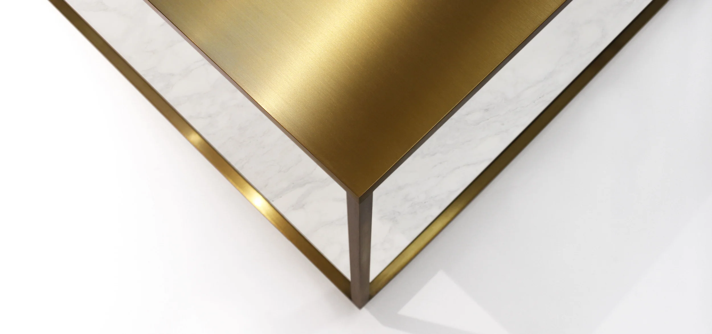
As part of the store concept, a small furniture collection was designed. The vision was to create a collection with an exclusive and homely feeling that endures the wear and tear of a busy store environment. The furniture is designed in materials such as brass and leather which beautifully take on patina over time. The pieces feature angled plinths, which not only create an elegant and light expression, but also prevent the case of marks from shoes and vacuum cleaners. Read more about The Cubic Table here.

