Copenhagen, Denmark / 2018
Interior
Design concept for TAX FREE by Heinemann (CPH Airport)
The conversion of the 2,600 m2 TAX FREE by Heinemann in Copenhagen Airport creating "a sense of place" in a super busy retail environment.
Project overview
| Location | Copenhagen, Denmark |
| Year | 2018 |
| Client | Gebr. Heinemann |
| Creative Director | Johannes Torpe |
| Design Team | Suguru Kobayashi, Rachel Mackay, Alice Phillips, Derya Arpaç, Beatrice Dinoia, Fabio Bellini, Rasa Marozaite, Kit Sand Ottsen |
| Services | Consultancy on conceptual storytelling and optimisation of flow |
| Area | 2600 m2 |
concept and storytelling
Gebr. Heinemann came to us asking for a concept that transformed the anonymous TAX FREE shop in Copenhagen Airport into a retail space with a sense of place. Early in the process we decided to focus on the city's atmosphere and the factors that make Copenhagen such a liveable place. The beautiful nordic light, changing seasons, unpredictable weather and being surrounded by water are some of the undeniable circumstances of living in Copenhagen and it was natural to integrate these characteristics into the shopping experience together with the concept of "hygge" – a Danish expression dedicated to an innate feeling of cosiness that can be achieved through environments and social situations.
The final storytelling evolved into to creating a ‘Hyggelig’ Copenhagen Experience. The concept divided the shop into zones highlighting different aspects of Copenhagen. The zones were named ‘joyful’, ‘nature’ and ‘re-think’ and throughout all the zones recurring elements of hygge was installed.
Creation of hygge
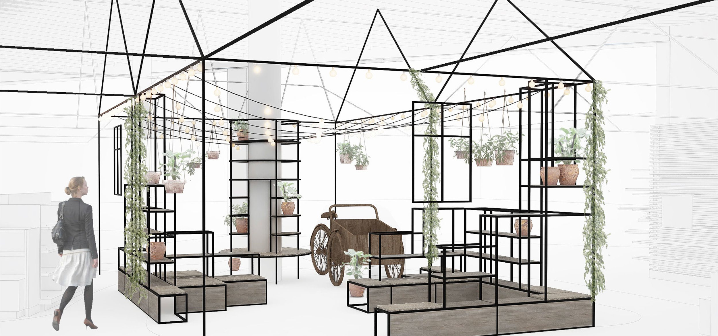
The feeling of hygge and comfort has been achieved through implementing details referencing private living spaces. Shelving systems, plants, visible light systems and display furniture covered in fabric and leather all create a homey atmosphere. Furthermore we worked with the idea of integrating communal seating areas into the retail space creating social touch points and meeting/waiting areas for fellow travellers.
Copenhagen specials such as the omnipresent cargo bike "Christianiacyklen", a nod to grandmothers kitchen, a homey bathroom setting and inspirations drawn from the city's food market Torvehallerne are other elements designed to bring a cosy Copenhagen-feeling to the retail experience.
Touchpoints of 'hygge' throughout the space.
“We have been very pleased with our collaboration and the challenge of consulting about what Danish ‘hygge’ entails and how to translate a feeling of homeliness into an extremely busy retail space. I think our efforts have resulted in a very exclusive, agreeable and efficient shopping experience.”
Columns
The space is divided by a large number of pillars. We turned them into shelving systems both giving them new purpose in the space but also creating consistency throughout the space. Three variations of the shelving were created to support the overall idea of dividing the shop into three areas. Our idea was to use the same materials in all three areas but with a change in the the color scheme.
Pastels and brighter colours are combined with light wood, tinted glass and leather in the "joyful" zone. Moving into the zone "nature" the leather is slightly used, the wood is weathered, the glass reflective and the color scheme brown and green. In the "re-think" zone the wood is aged, re-used windows are installed, the leather is old and the dominant color is grey.
Surfaces of Copenhagen
Using paint in different color schemes and patterns we reinterpreted the textures and grain of Copenhagen as a new floor design in the retail space. The ambition was additionally to ensure a good flow between the three zones by creating smooth transitions in the already existing pattern in the wooden floor.
In the joyful zone we used toned down pastel colours dispatched as small ripples in the water surface reflecting the colourful houses found by the harbour front in the city centre. Moving into the nature zone the colours change into darker brown and green tones and the pattern becomes more dense only to change again when you move into the re-think zone becoming larger square patches of solid grey mimicking the cobblestone used on streets in central Copenhagen.
An exclusive bathroom vibe
The idea behind the designated area for airport exclusives is to exhibit the products in an environment exuding an exclusive bathroom vibe. We custom designed the display furniture with curved corners, lacquered surfaces in pastels colours and integrated mirrors and upholstered pufs to sit on. It is the exclusive bathroom we all want at home and enjoy in fancy hotels. It is relatable and desireable at the same time.
The cargo bike
The omnipresent cargo bike is a Copenhagen Classic. Everywhere in the city you see people transporting everything from grosseries to furniture to their kids in these. In the airport environment they have been transformed into "waterbikes".
“Together with Johannes Torpe, we have created a new design image with an exceptional experiential character for customers that is unique in the travel retail sector.”
Natural light
The sensation of walking under the trees with the sun cutting through the leaves in a busy city setting was something we wanted to bring into the equally busy retail space. We played with different ideas of implementing layers, transitions and transparency. The ceiling height varies quite a lot throughout the retail space, and especially in the lower areas the use of reflective material in the ceiling helps to create a lighter feeling. Adding to this an existing skylight, that had previously been covered, was opened up and natural light was invited inside once again.
Re-think
The idea behind the re-think zone was to provide costumers with calm oasis within the large and very busy retail space. Visualised like an open courtyard with a ceiling made of raw steel we drew our inspiration from the busy food market "Torvehallerne" in Central Copenhagen. Here the many options of communal seating invites for both relaxation, socialising and provides shoppers with the possibility to sit down and enjoy their purchase on the spot.


