Lynge, Denmark / 2018
Interior,Architecture
United Cycling Lab & Store
A retail space that fosters knowledge, learning and innovation and perhaps even more importantly, inspires people to dream.
project overview
| Location | Lynge, Denmark |
| Year | 2018 |
| Status | Built |
| Client | United Cycling |
| Creative Director | Johannes Torpe |
|
Senior Architect / Project Leader | Kit Sand Ottsen |
| Design Team | Karolina Pajnowska, Rachel Jayne Mackay, Suguru Kobayashi, Allan Sejer, Allan Kruse |
| Area | 1650 m2 |
| Services | Showroom and retail design concept, Façade, Landscaping, Office space, Cantina, Construction drawings, Procurement |
| Materials | Exterior: Perforated white lacquered aluminum plates, Concrete tiles, Wooden lamellas Interior: Oak, Raw and Black steel, Concrete, Ultra-clear and Reflecting glass, Aluminium, Linoleum, Barrisol |
| Additional Credits | Construction drawings and on site construction management in collaboration with Heede Consult / Automation solution by Sensa A/S Barrisol ceiling by Lumiére Stretch Ceiling / Product Display Furniture by Scan ID / Ceiling by Lumiére Stretch Ceiling |
| Photo Credits | Alastair Philip Wiper |
| Video Credits | DONNA media |
| High res press downloads |
design concept
High performance bicycles from Argon 18 are displayed in a futuristic retail experience that blends elements from the world of technology, engineering, mechanics and community. Here harmony exists between man, nature and machine. It is a space that fosters knowledge, learning and innovation and perhaps even more importantly, invites people to dream. In short, a modern monastery for the science of cycling.
The design concept draws its inspiration from the detailed engineering of a carbon fiber bicycle. It seeks to highlight the dreams and engineering that the bicycles represent. We have done this by juxtaposing the world of nature and science and the meeting between man and machine.
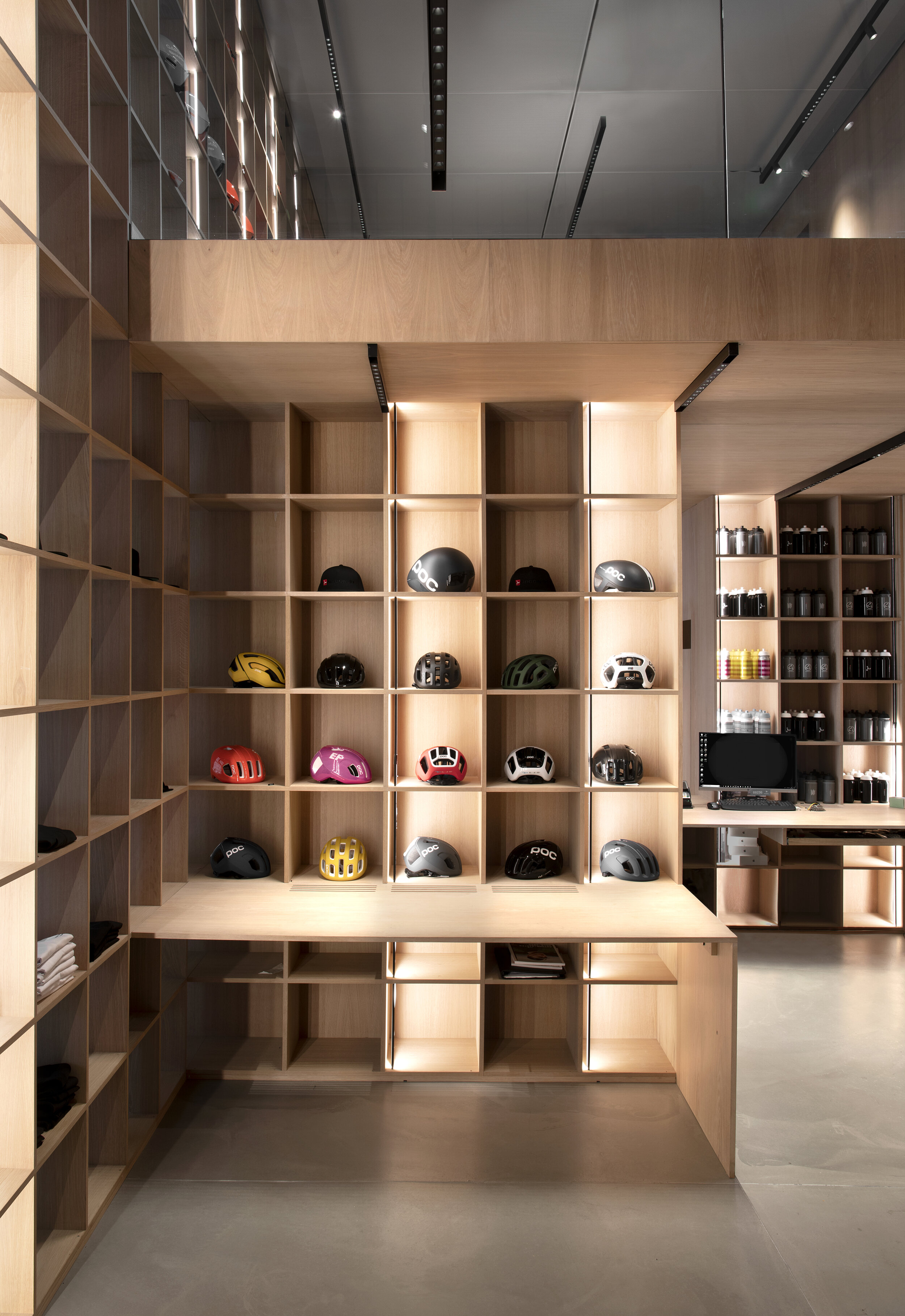
The architectural design follows a tight grid system that is introduced throughout the building and perhaps is most noticeable in the interior design. This choice pays tribute to the precision of the products and ensures a modular and scalable retail solution for a global rollout.
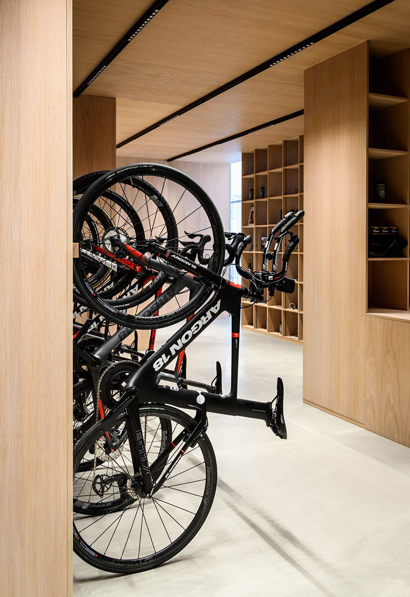
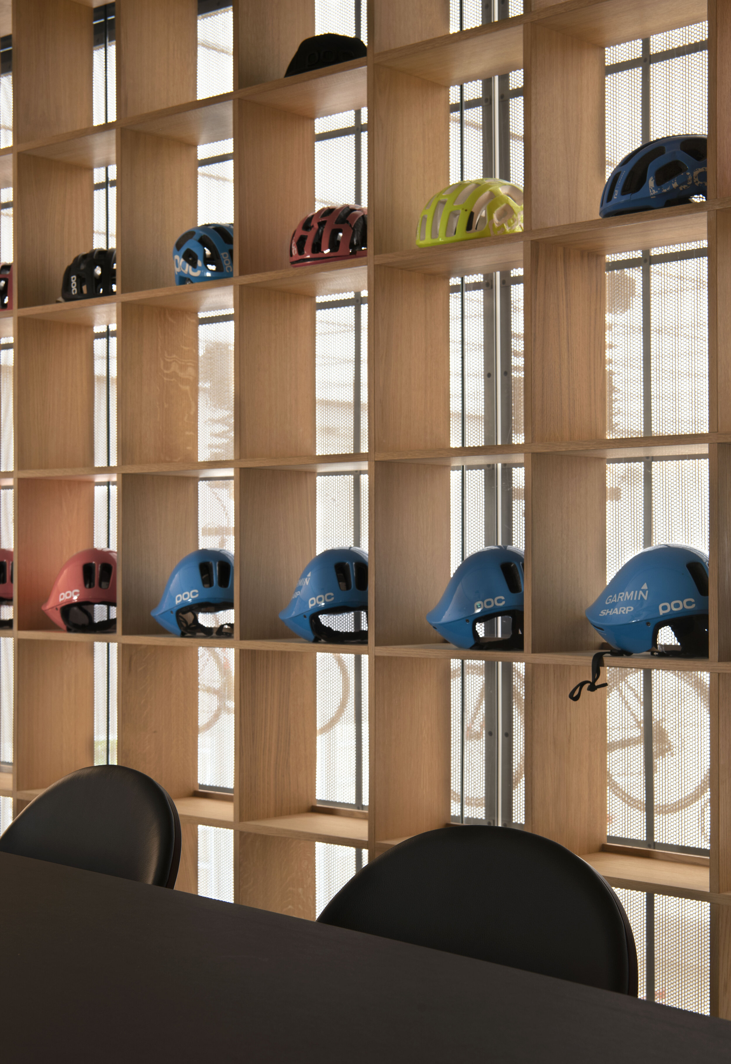
The store includes a product gallery with accessories and spare parts, a workshop, a bike-fitting area and offers training facilities on Watt bikes. The full project comprises of office facilities, meeting rooms, cantina, storage facility and an outdoor plaza by the main entrance, perfect for industry meet-ups and events.
Drawing on the idea of the monastery, all the functions of the facility can be transferred to those of a classic monastery; The showroom is the chapel, the offices are the dorms, the cantina is the refectory, the product gallery is the library, the training facility is the choir and, the workshop is the forge.
A dull industrial building from the 1990s has been transformed into a retail experience and Head Quarters for the Danish agency of Argon 18-bicycles, United Cycling. It is their goal to make it a Nordic hub for the sport and we have worked together with them to create an architectural concept that support the dream.
Bird eye view of facility before transformation.
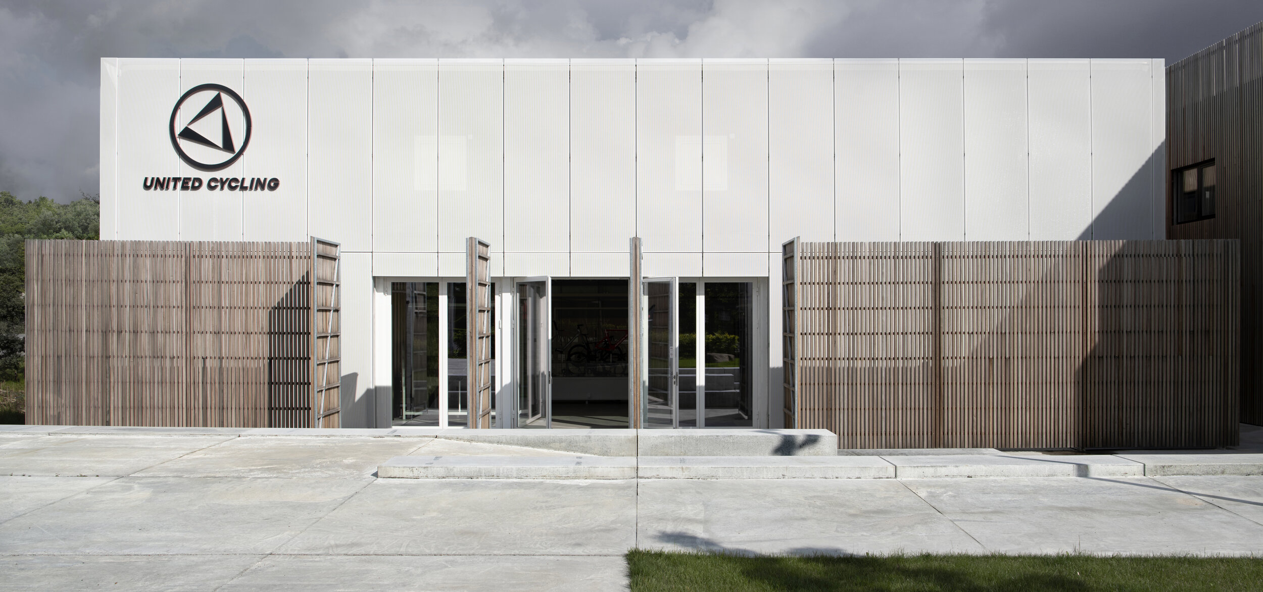
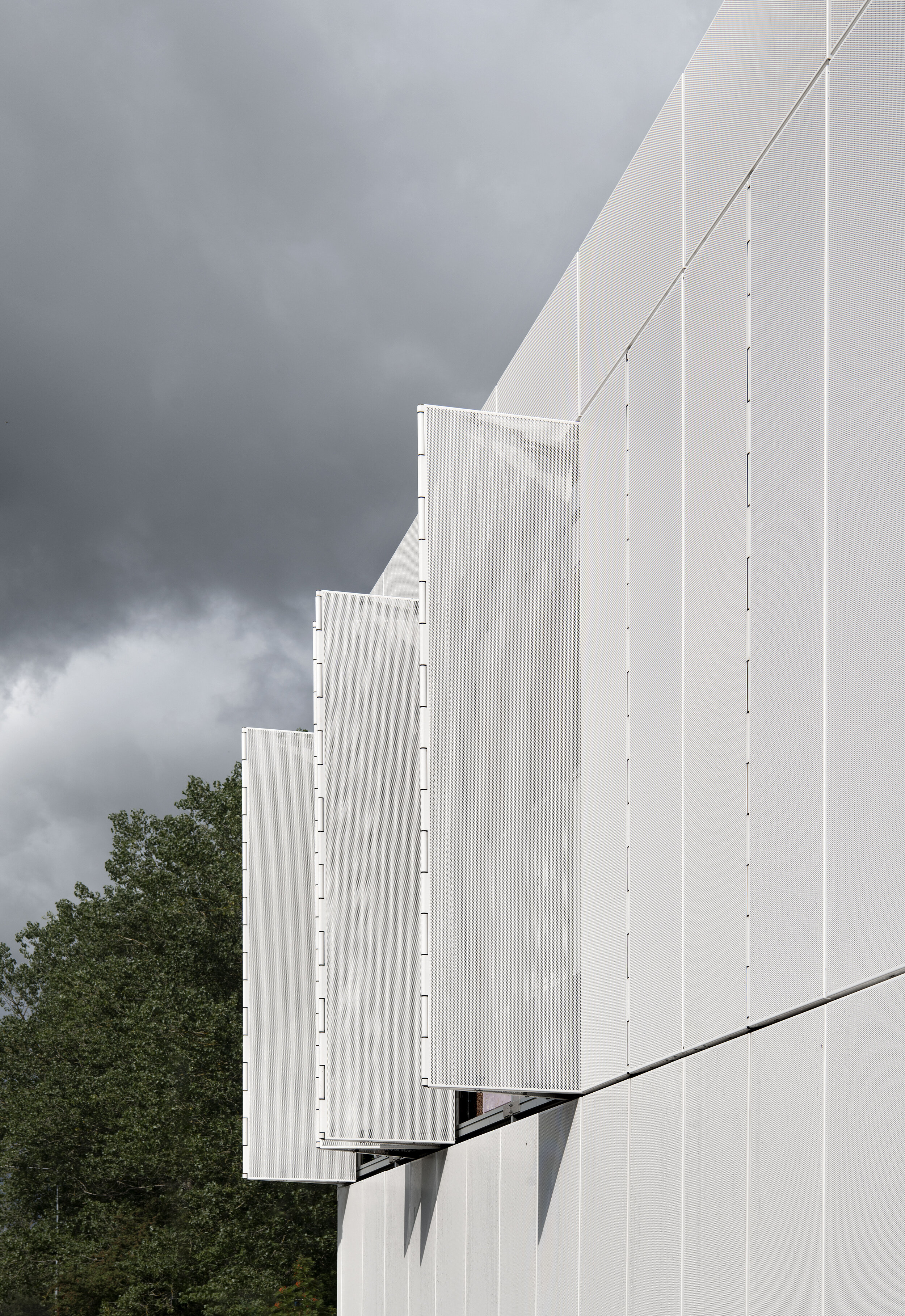
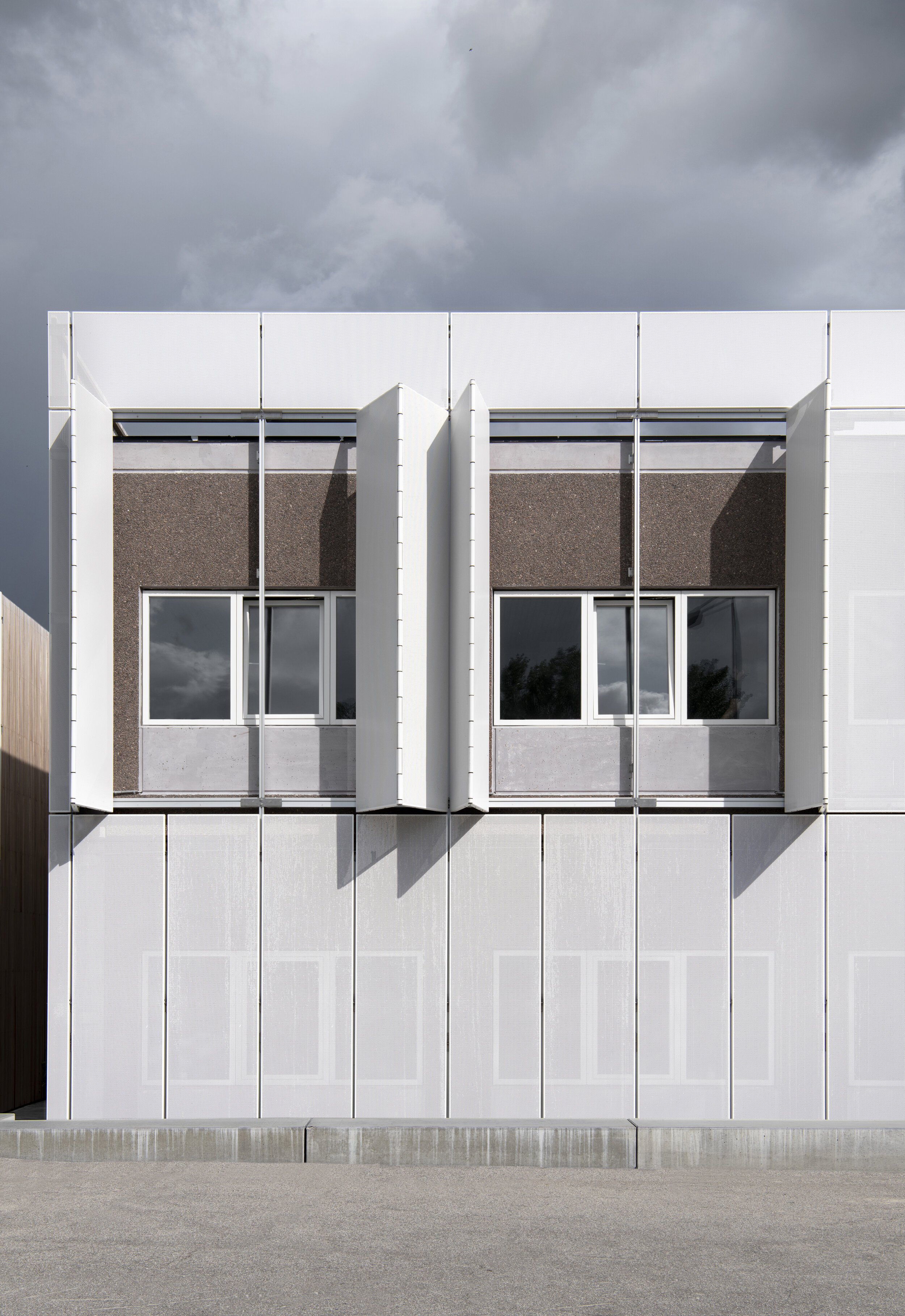
The façade of the renewed facility upon accomplishment.
Plan, Ground floor, 1:150
Plan, First floor, 1:150
Sections (1:100) through Showroom, Training facility, Workshop and Storage.
Sections (1:100) through A) Product Gallery, VIP meeting room and Storage / B) Packaging area, Odex Showroom, Office Spaces and Cantina.
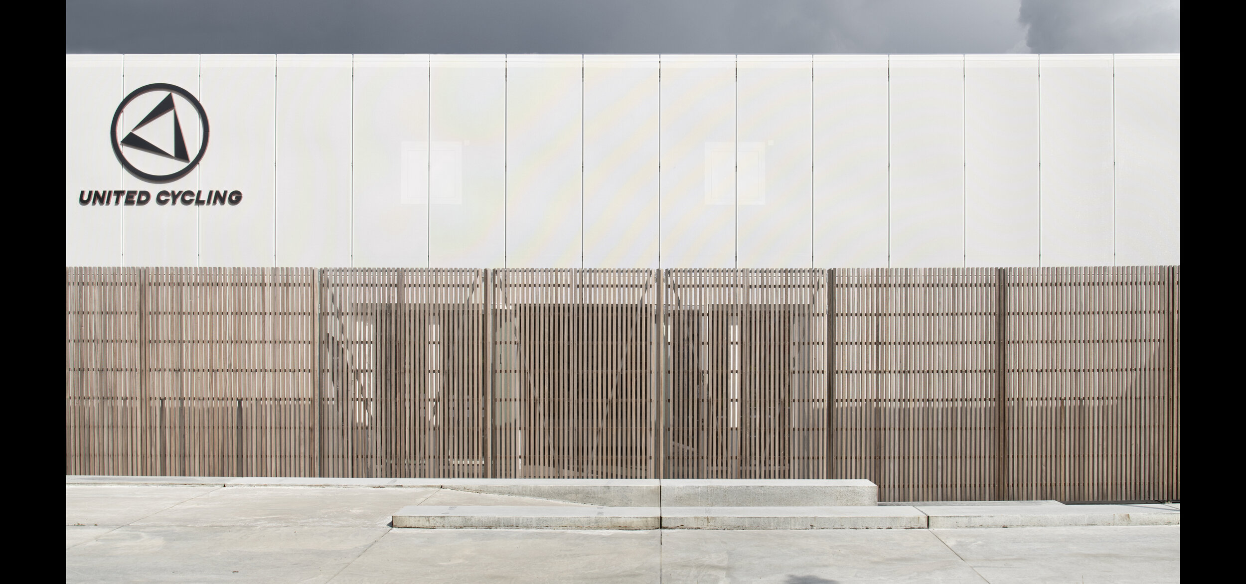
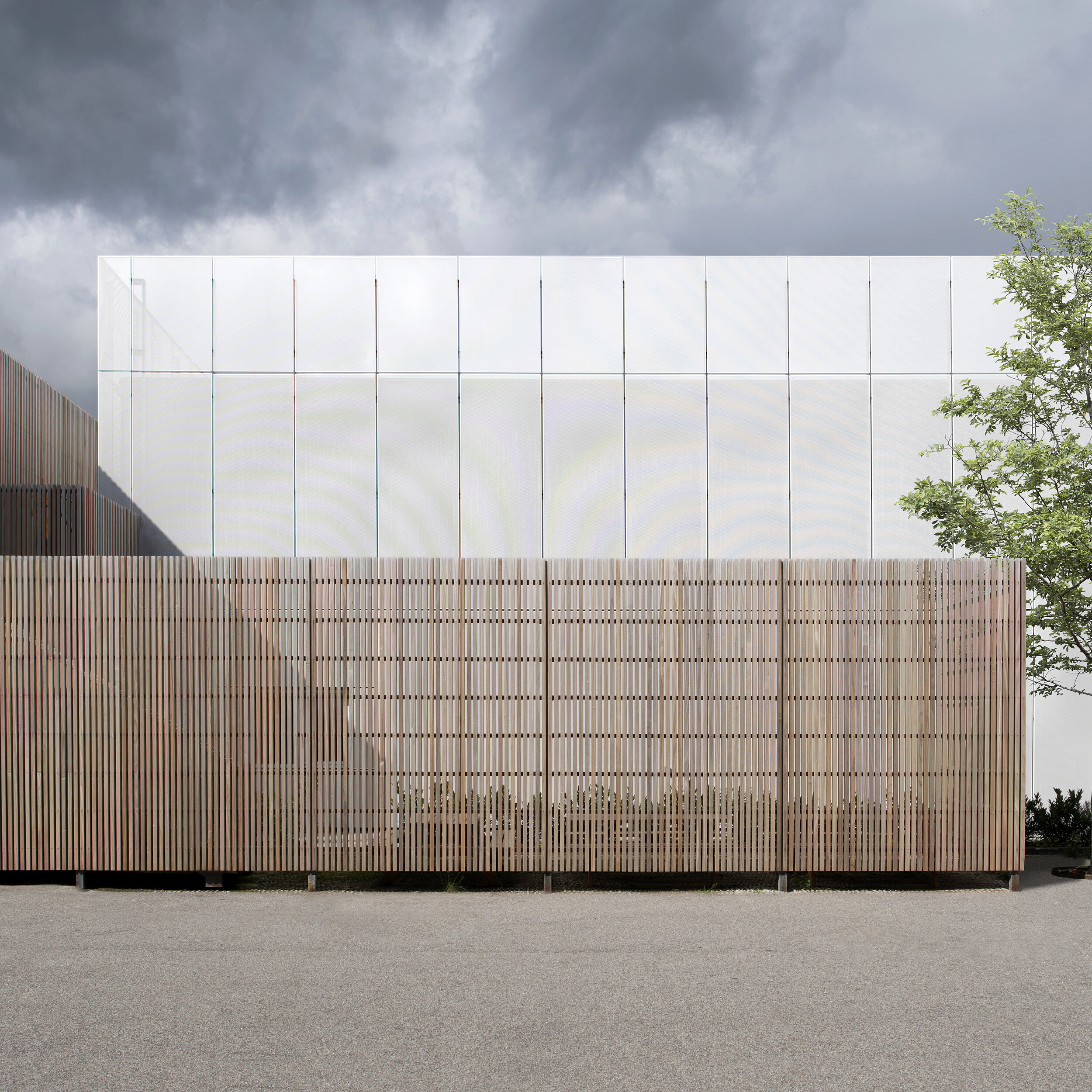
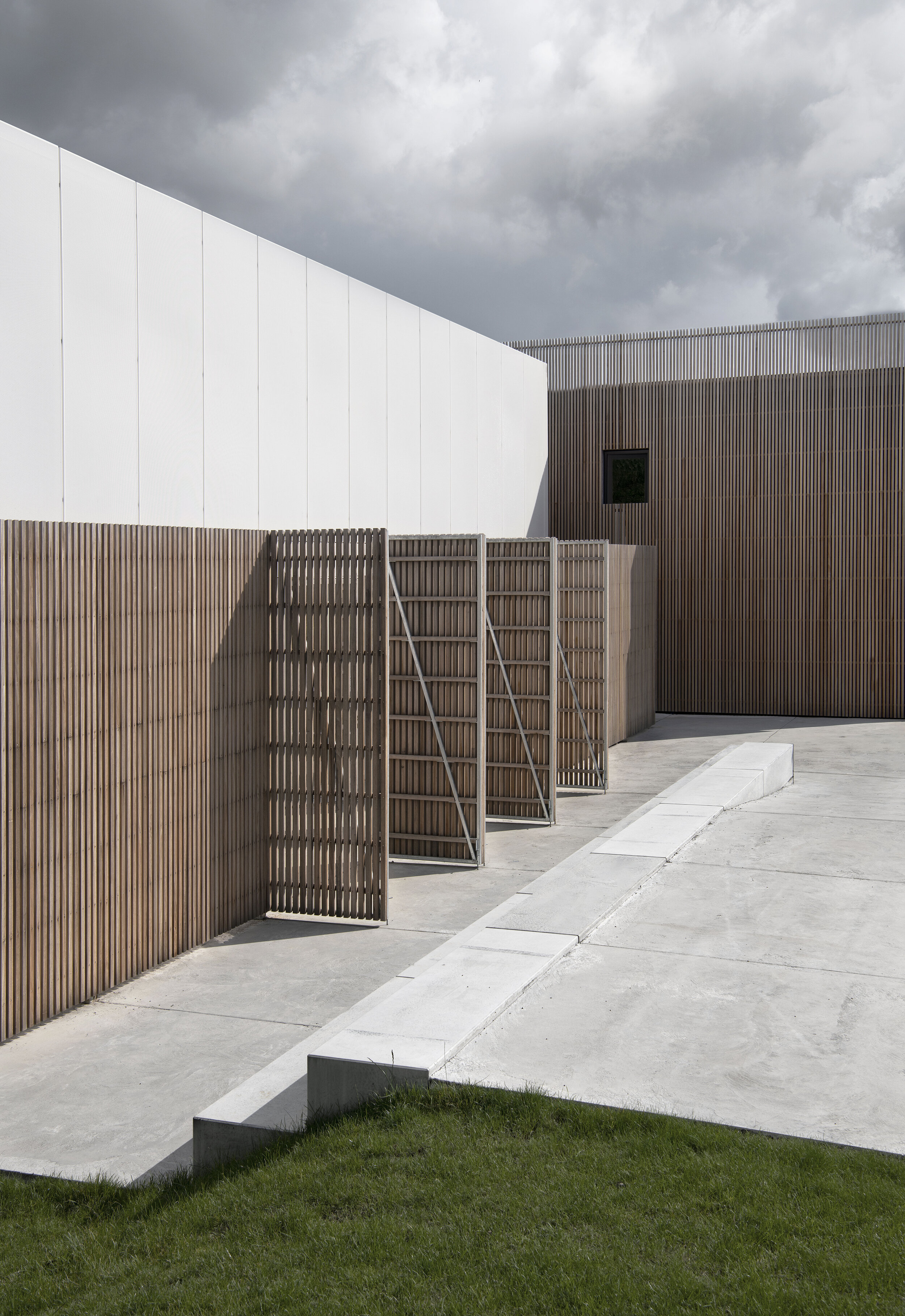
Exterior wooden lamellas on the eastern façade of the building
Southern passage to the entrance of the library
Outside space designed for industry meet-ups & social events
A new connection on the first floor connecting the volumes
“In short, we have designed a retail space that fosters knowledge, learning and innovation and perhaps even more important, inspires people to dream. ”
The showroom is the chapel
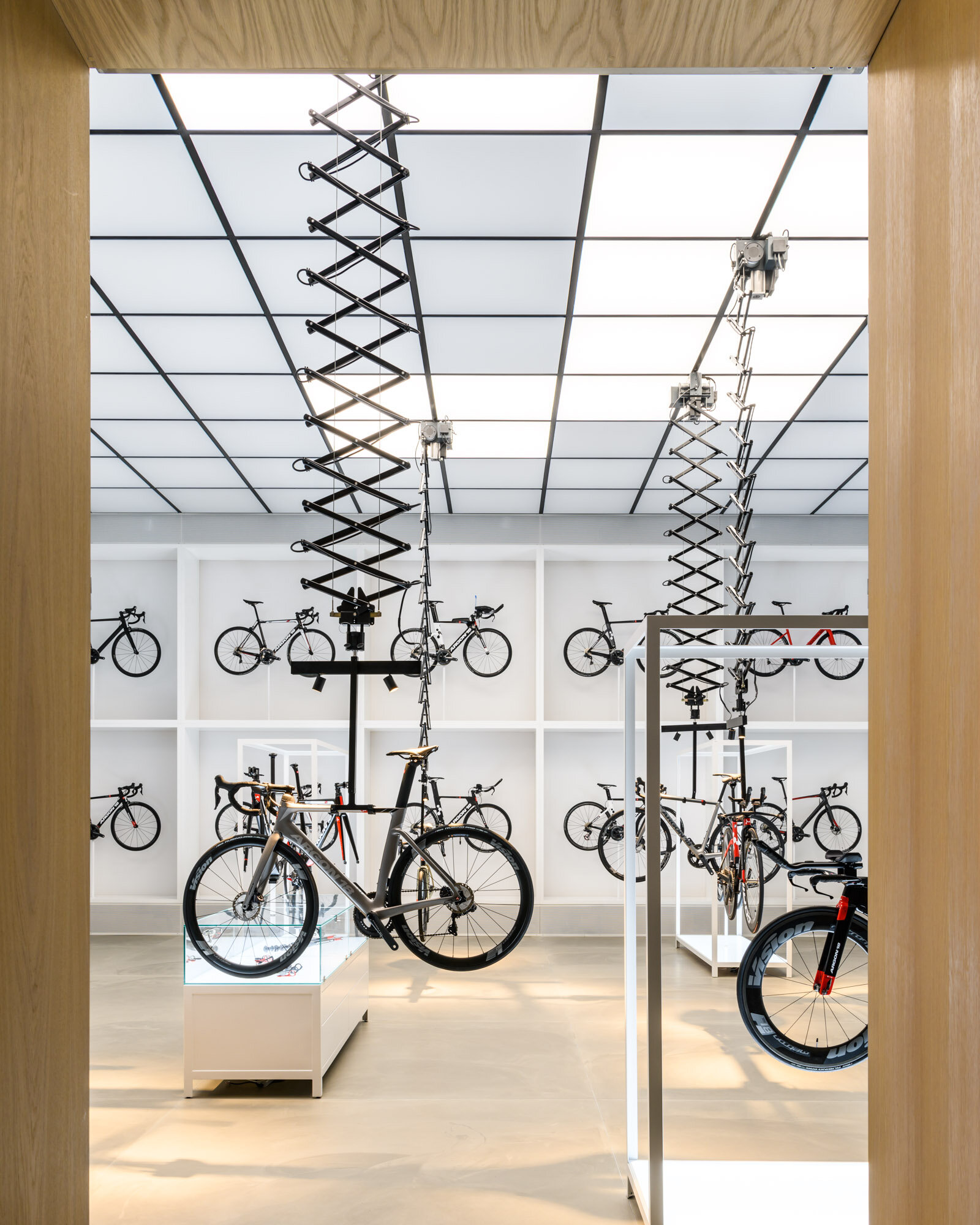
Concrete floors, bright white walls, custom built illuminated product display furniture and 6 meter ceiling heights with white luminous ceiling panels make the impressive framework of the showroom. One wall is a customised illuminated display for 8 bikes and suspended from the ceiling are five pantographs that elegantly display a selection of bicycle prototypes. With the click of a button they can be lowered down for inspection by the customer. Mechanical, old fashioned and tactile all at once. Five display elements with lit surfaces and a cabinet box allows customers to take a closer look and feel of the individual bike parts.
The power of the product
The showroom is designed to elevate the bicycles and display their sovereignty. It is a chapel for the bicycles and offers an invitation to admire the products for their technical superiority, to inspect and touch them. All elements in the showroom and the product gallery follow the same gridlines. The combination of precision and the very technical products on display creates a clinical yet ethereal atmosphere – almost like entering a sci-fi laboratory.
“The result is a clinical and futuristic lab - a toy store for the passionate and serious rider. We call it a modern monastery for the science of cycling.”
design focus
Materials
The carbon fiber bicycles from Argon 18 are some of the lightest in the world and inspired us to choose materials that exude lightness and have an airy yet industrial feeling to them. Bringing the larger theme of nature versus science into play, warm and natural materials such as oak are juxtaposed by the cold industrial feeling of concrete floors, black steel, reflective glass and illuminated ceilings.
Transparency
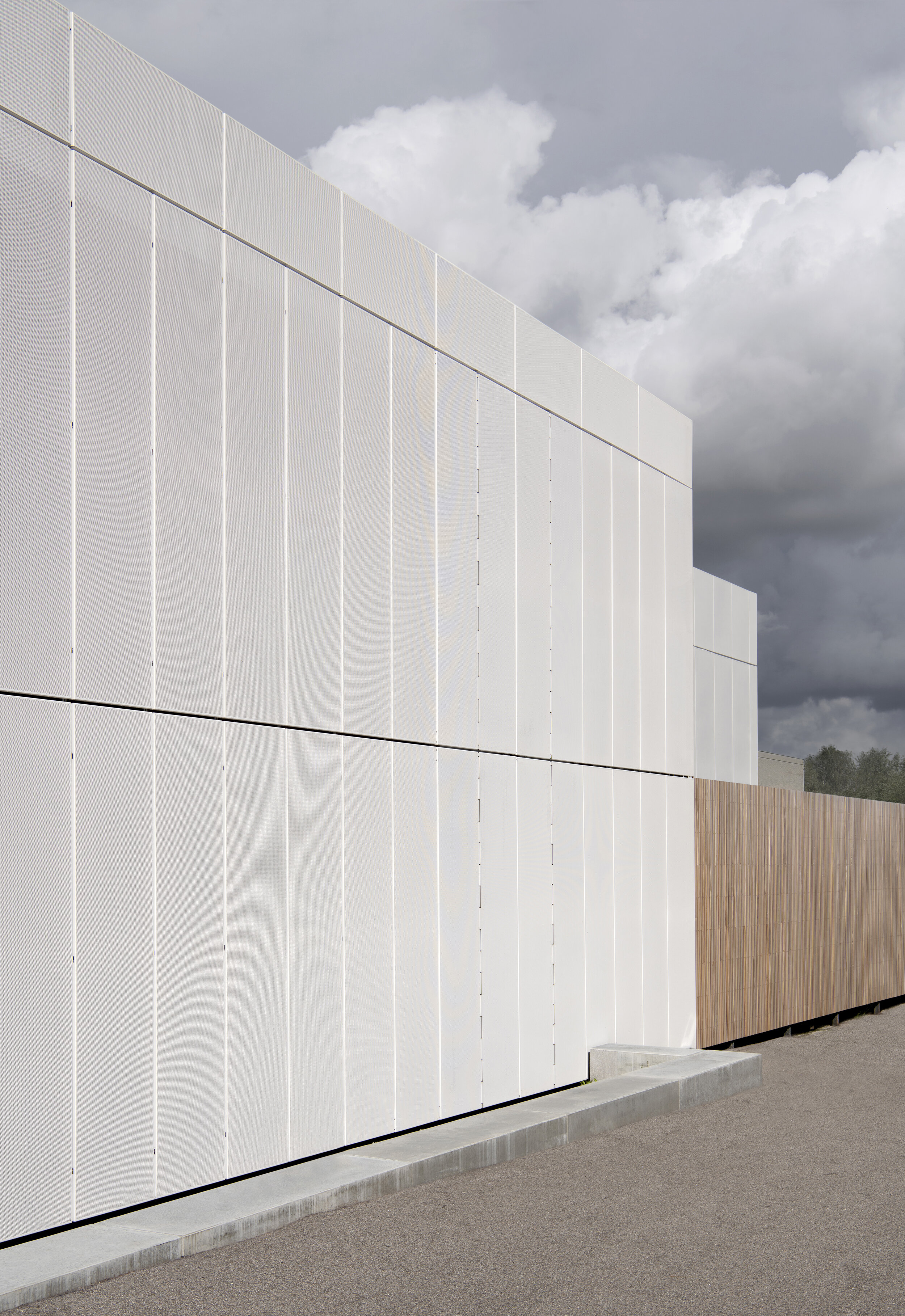
The existing façade has been covered in white perforated aluminum plates; A material that references both the lightness and the precise engineering of the bicycle. By the entrance areas and passageways the facade material change to wooden lamella. All the functions inside the building are equally connected by different transparent materials such as perforated metal plates, wood lamellas and glass walls. Combined with the open space it allows for a full overview of the world of high-performance cycling – from the physical to the technical realms.
Landscaping
The new main entrance has been established with a plaza designed for industry meet-ups and client events. Next to the main entrance a bike parking and cleaning station with air pump and running water is established. The square is set with rectangular concrete tiles referencing the modular façade on the building and the floor in the showroom.
Images of facade, landscaping and back office facilities will follow shortly.
“I come from a culture where dreaming is encouraged and community and togetherness is precious. For those reasons it was natural for United Cycling to partner with Johannes Torpe on the journey to create a new and vibrant platform for Argon18-bicycles in Europe.
It naturally makes me proud and happy, that United Cycling is now honoured with the FRAME Award. But it makes me as much as happy to see how the place has already become a hub for cycling. A place that attracts cycling enthusiasts from near and far. Both as guests in the store, but also for company- and club events. ”


